Collaborate with AI Inside the Strategic Overview
The read on a page before anyone starts fixing it — strengths, weaknesses, and where the real opportunity is.
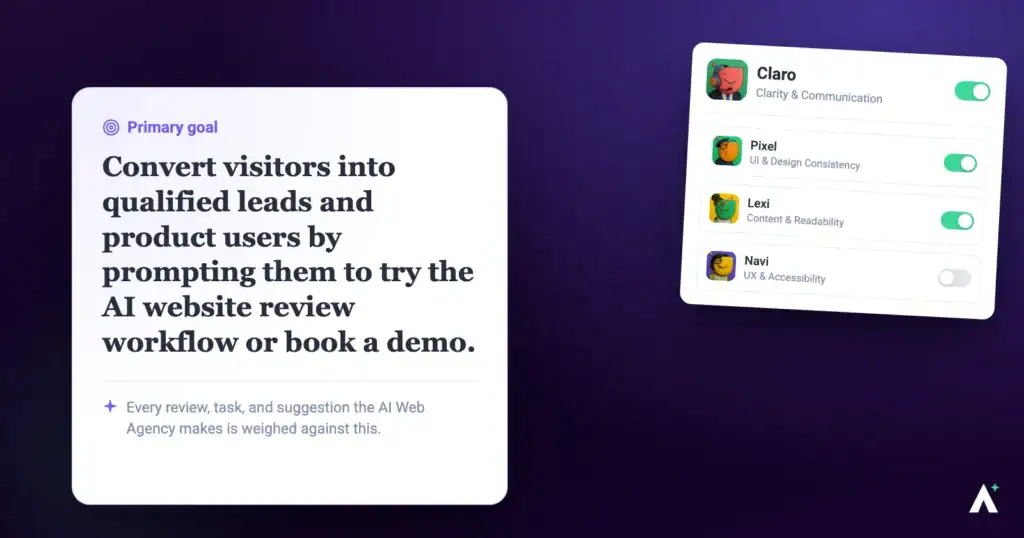
A list of forty findings tells you what's wrong. It doesn't tell you what matters, or what you'd say to the client on Monday. The Strategic Overview is the step before that list: a read of the whole page — what works, what doesn't, and where the opportunity actually is.
What it is
The Strategic Overview is its own phase, and only Claro is active in it. The specialists aren’t involved yet. Claro reads the page, builds a structured picture of it, and gives you a summary covering strengths, weaknesses and the key opportunities to improve.
| Strategic Overview | Full review | |
|---|---|---|
| Who’s working | Claro alone. | The specialists you selected. |
| What you get | Strengths, opportunities, what great looks like, and next actions. | Individual findings pinned to elements. |
| Tasks created | None. No screen size-specific findings. | Findings across desktop, tablet and mobile. |
| Best for | Deciding what to do. | Doing it. |
Running one
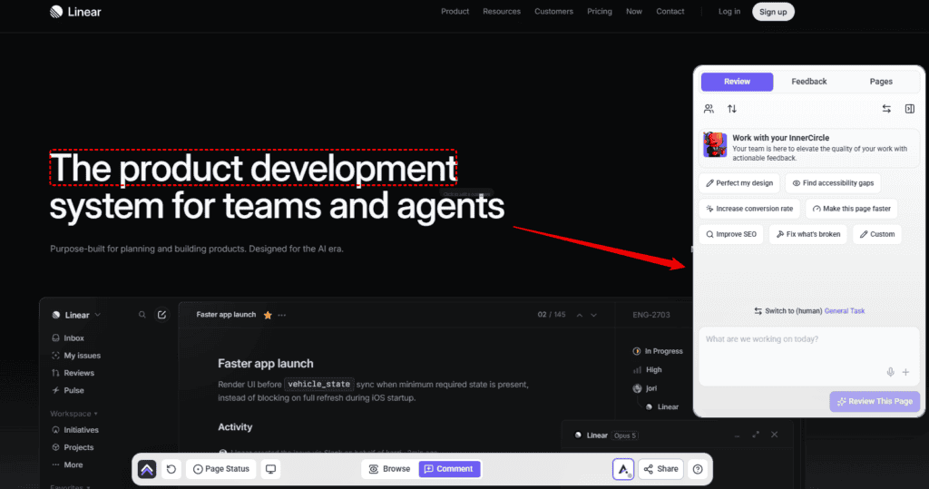
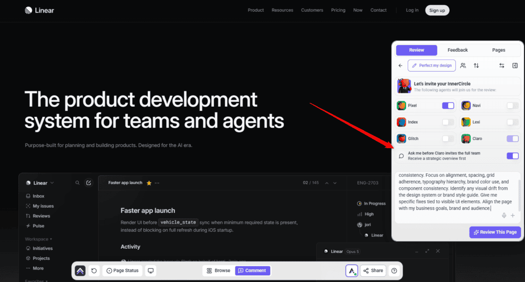
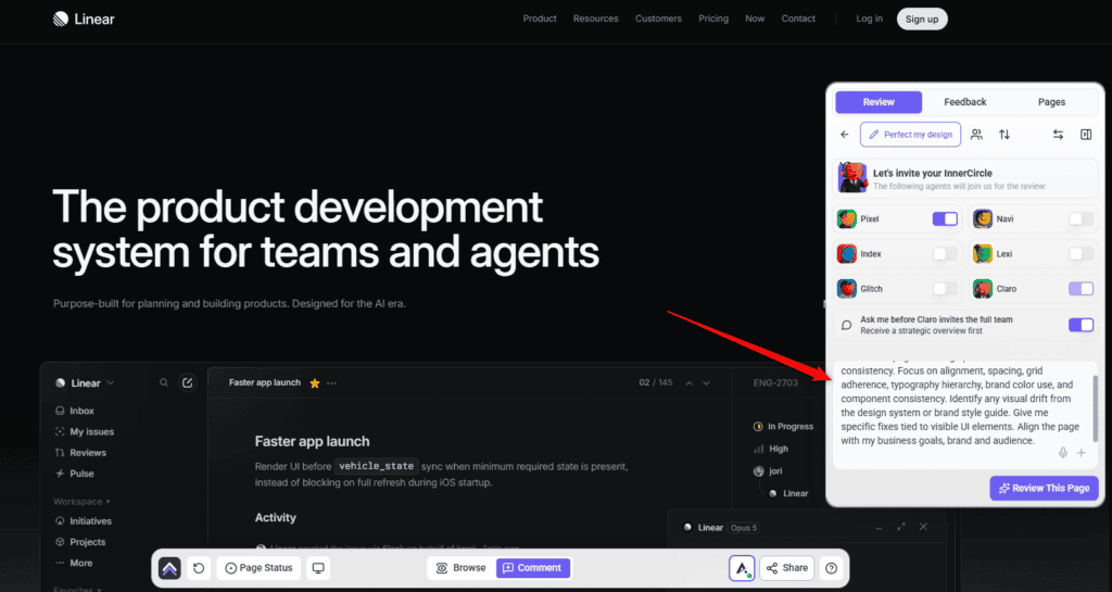
Strategic Overview is Claro working alone — the specialists stay out of it until you invite them.
Instructions:
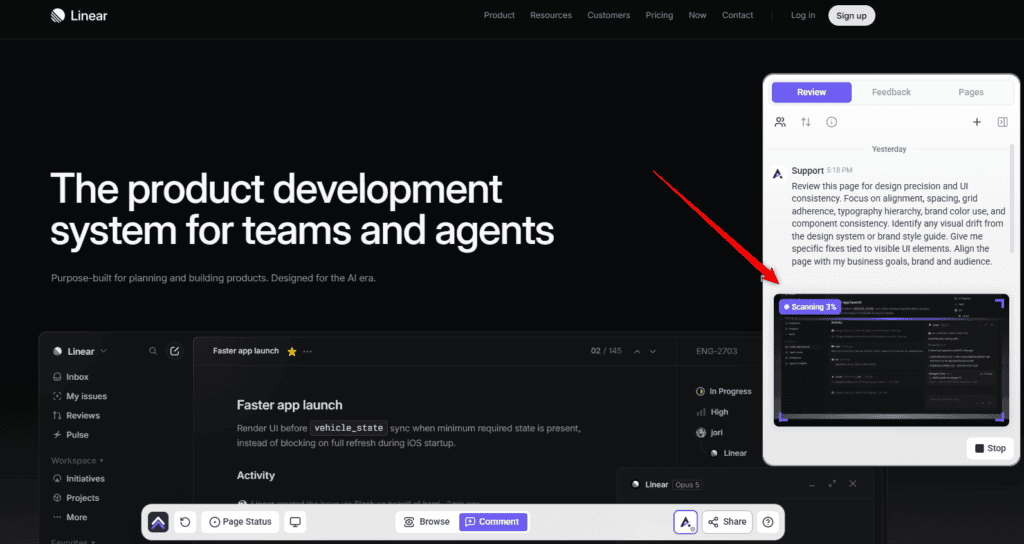
What the Overview gives you
It comes back in four parts, in this order. Each answers a different question, and the order is deliberate — it moves from where you are to what you do next.
| Section | What it answers |
|---|---|
| Strengths | What’s already working on the page, and worth keeping. The part most people skim and shouldn’t. |
| Major opportunities | Where the real gains are — not every flaw, but the handful that would change the page’s performance. |
| What “great” looks like | The standard being measured against, described concretely rather than assumed. This is what makes the gap between now and better legible. |
| Next best actions | What to actually do, in order, given everything above. |
What it works out about the business first
Before judging anything, it builds a structured picture of what this site actually is:
Strengths
What the page already does well. It exists because a review that opens with forty problems is a review nobody acts on, and because you often can’t tell which parts of an inherited site are load-bearing until something says so.
Major opportunities
Not a list of everything wrong. The things that would actually move the page — which is a different and much shorter list.
What “great” looks like
The standard the page is being held to, spelled out. Most reviews leave this implicit, which is why their findings feel arbitrary — you can see what someone thinks is wrong without ever seeing what they think right would be.
Next best actions
What to do, in order. This is where the Overview stops describing and starts recommending.
It measures, not just reads
The Overview isn’t an impression of a screenshot. Claro can pull real data on the page while forming it.
| Measurement | What it adds |
|---|---|
| Lighthouse (page speed) | A real performance score — the Lighthouse report — so “the site feels slow” becomes a number you can put in front of a client. |
| Accessibility report | A proper pass over the page rather than a visual guess at what might fail. |
| Keywords & Trends | Whether the terms the page targets are rising or falling — useful when the question is where to aim, not just what to fix. |
Talking to it
The Overview is a conversation rather than a document. Once you have it, you can reply and push on it — and Claro answers with the page in front of it.
Claro is the only one here. The specialists haven’t been invited yet, which is the whole point of the setting you left switched on. So ask strategic questions — what’s worth doing, in what order, given what constraint. If you ask for specific copy or a styling change at this stage you’ll get Claro’s read on whether it’s the right move, not Lexi rewriting the line or Pixel restyling the button. That work belongs to the phase after this one.
Useful things to ask:
What it’s built from
The Overview isn’t written from the screenshot alone. It reads the project brief — the brand, the business, the audience, the goals — and judges the page against them.
Then the specialists
When you’ve decided what’s worth doing, the full review is the next step. Click Start Review and the specialists you selected — your InnerCircle — go to work, producing findings pinned to elements across desktop, tablet and mobile.
This phase is a close visual read rather than a second round of measurement. Each specialist works the page at each screen size against the standard the review judges by, measuring contrast where colour is the question. The performance and search data was already gathered for the Overview.
Detail on that phase is in Getting The Most Out Of The InnerCircle.
What Claro sends back
Two messages, in order.
Team Handoff
This arrives as soon as the specialists are brought in. It confirms the review has started and sets expectations:
The summary
This arrives once every specialist is done, and it is organised the same way each time.
| Part | What it covers |
|---|---|
| Overall Impression | How the page reads as a whole, and the gap between where it is now and what you asked for. |
| Recurring Themes | Findings grouped by frequency rather than listed flat. Each theme names how many comments it covers and points at the individual ones. |
| Team Notes & Observations | Where the specialists agreed, and whether any comments are low-value or redundant. |
| Time Estimate | Roughly how long the work should take, adjusted to the experience level set on the review rather than a fixed baseline. |
| Top Priorities | The findings ranked high, medium and low, each with the reason it sits where it does. |
| Next Steps | What to do with the comments, and when to run another review. |
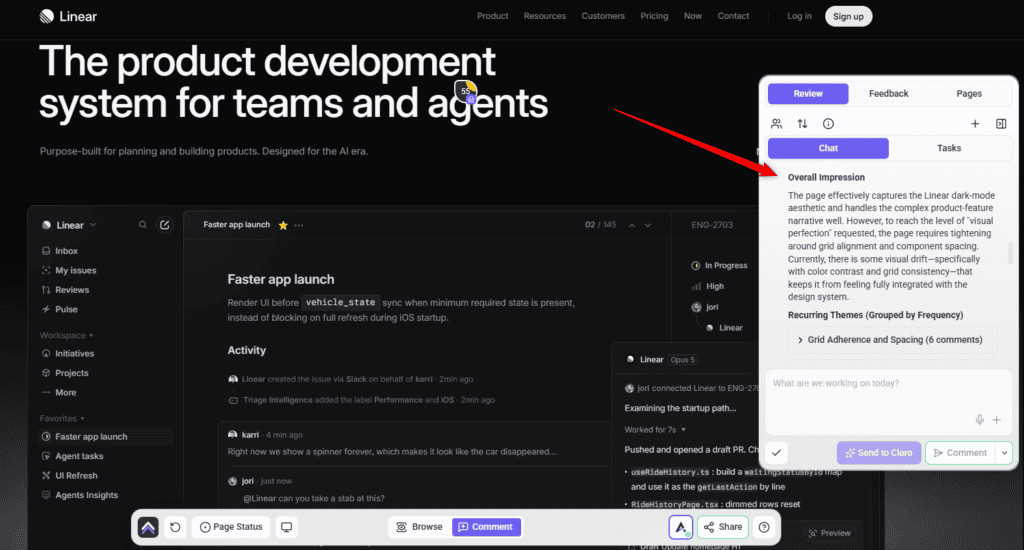
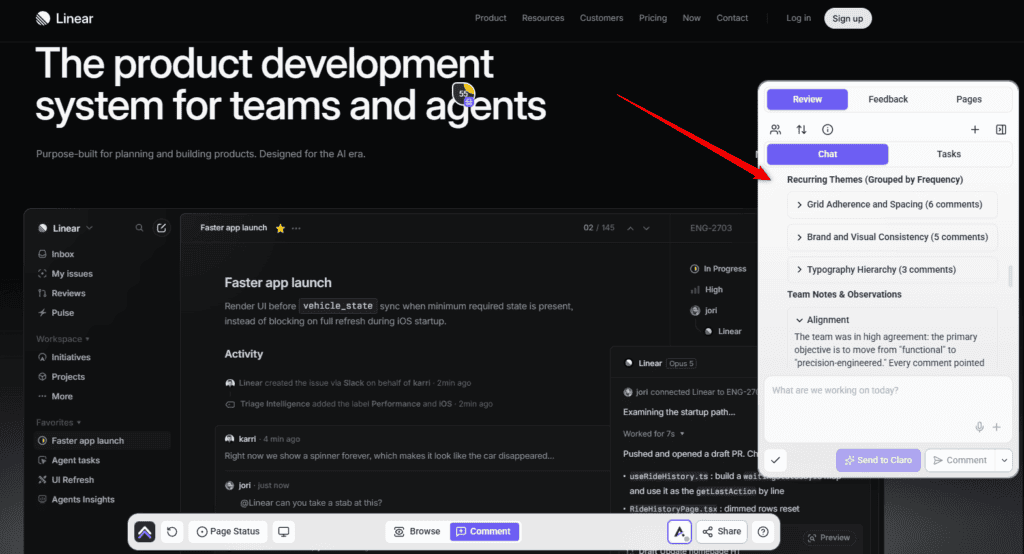
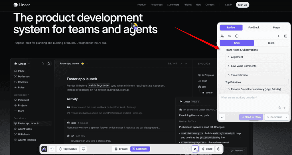
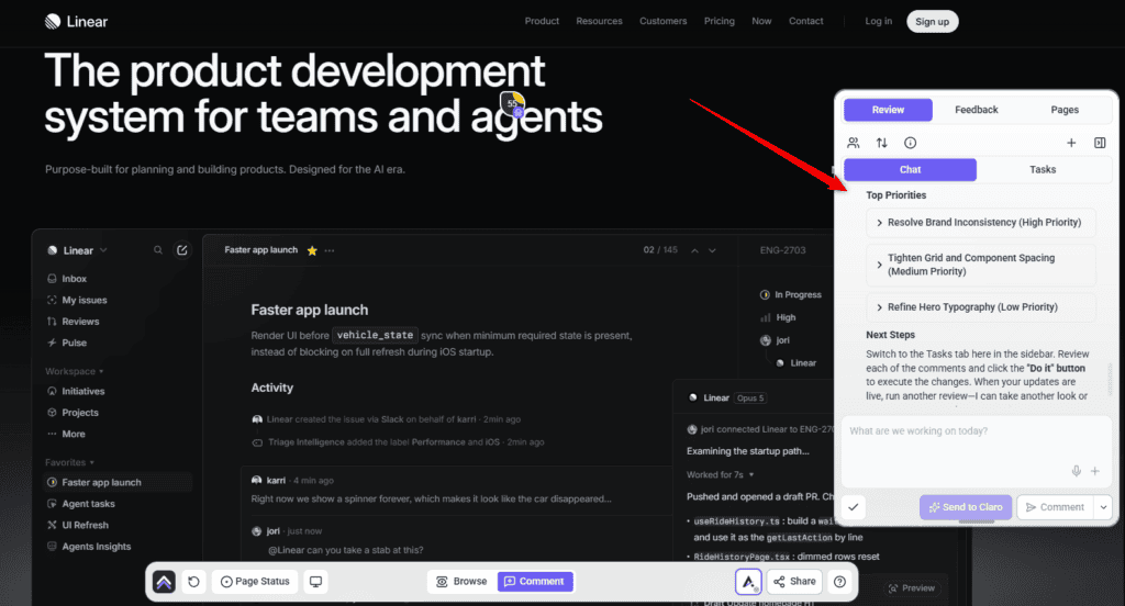
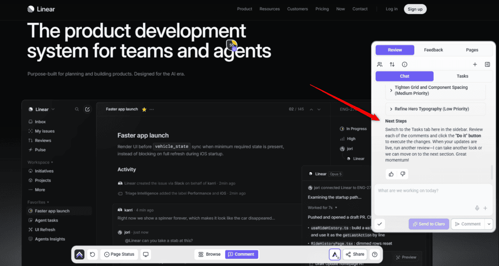
Recurring Themes is the part worth reading first, because it shows the pattern rather than the list. It looks like this:
Spacing and alignment (6 comments) — structural spacing flagged in several places. The layout works, but the rhythm is inconsistent enough to read as drift. Tightening it lifts perceived quality more than any single fix.
Brand consistency (5 comments) — components deviating from your brand kit, including one card with a background that fights the rest of the palette.
Typography hierarchy (3 comments) — small editorial corrections, such as a heading breaking awkwardly or letter spacing in a footer.
The same thing without a page
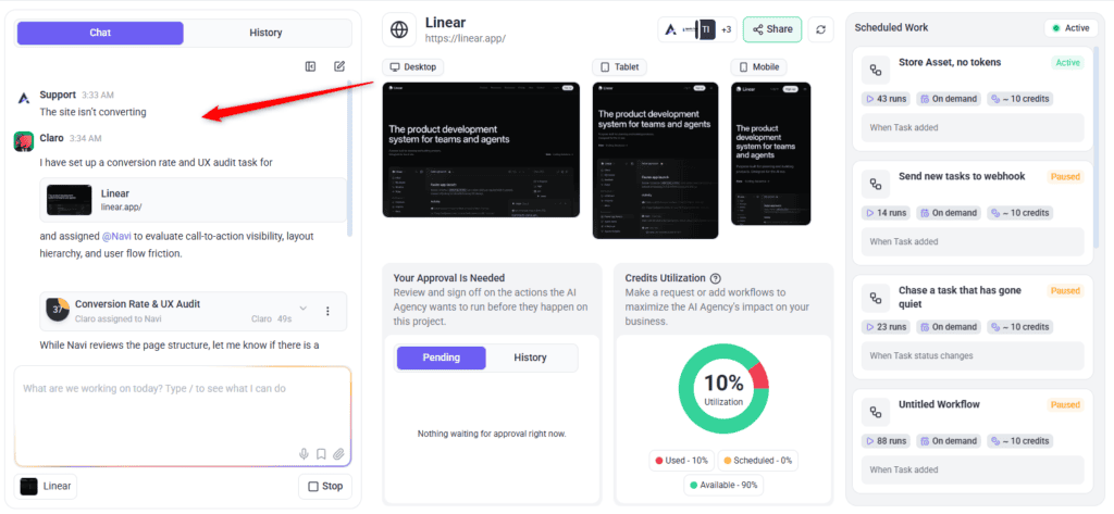
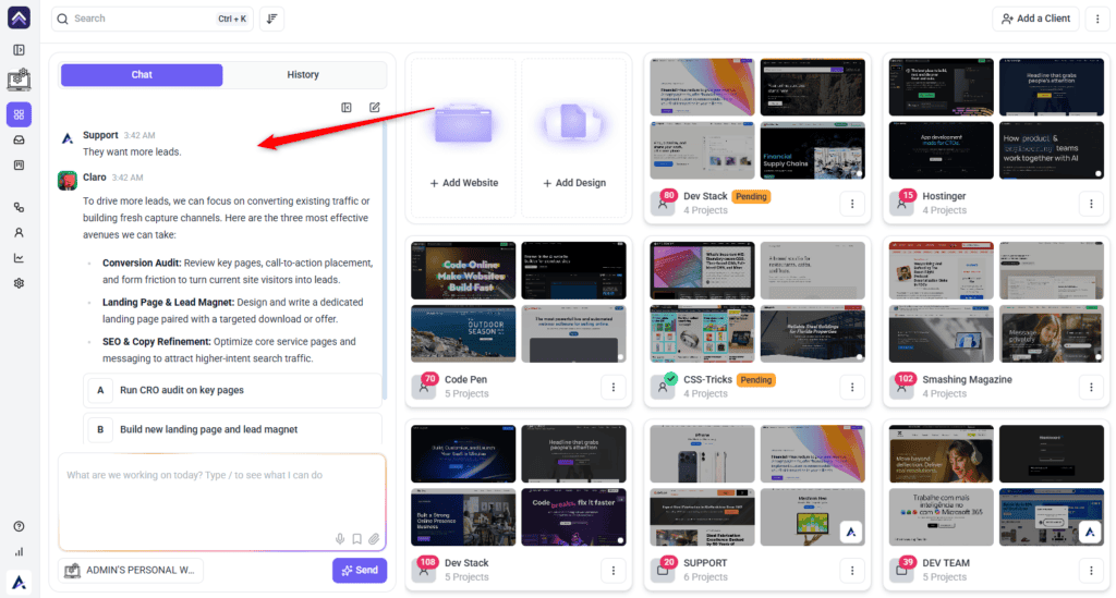
You don’t always have one page in mind. Broad, open-ended asks work in workspace chat too, and Claro scopes them the same way before any work is routed.
Where it earns its keep
| Situation | Why the Overview helps |
|---|---|
| A site you didn’t build | You need the shape of the problem before you can quote for it. A findings list doesn’t give you that. |
| Before a client conversation | You walk in with a position rather than a list, and you’ve already thought about what you’d recommend. |
| Scoping a fixed budget | Tell it the constraint and get a view on what fits inside it. |
| A pitch | A read of a prospect’s current site, framed as opportunities rather than criticism. |
| A client who thinks the site is fine | Strengths as well as weaknesses, which makes the weaknesses land better. |
White-label behaviour
Frequently asked questions
Which specialists take part?
None. The Strategic Overview is Claro alone. The specialists come in when you start the full review.
Does it create tasks?
No. It deliberately produces no element-level or screen size-specific findings — that’s the next phase.
Does it change my site?
No. Both the Overview and the review are read-only. Changes only happen when you ask for the work and approve it.
Can I ask follow-up questions?
Yes, and it’s the most useful thing you can do with it. Give it your constraints — budget, timescale, what the client actually wants — and the answer changes accordingly.
Why does it feel generic?
It judges the page against the project brief. With no brand, business or audience set, it can only assess the page in the abstract.
What does the Overview actually contain?
Four sections: your page’s strengths, the major opportunities, what “great” looks like for this page, and your next best actions.
Why does it tell me what’s good as well as what’s wrong?
So you know what to keep, and so a client conversation has somewhere to start. On an inherited site it also tells you which parts are doing real work before you change them.
Is it based on real data or just the screenshot?
Both. Alongside reading the page, it can pull a real page speed report, an accessibility report, and keyword trend data.
Can I get this without running it on a page?
Yes. Ask a broad question in workspace chat — “where do we start with this client”, “the site isn’t converting” — and it gets scoped the same way before anything is routed.
Can I skip it?
Yes — switch off Ask me before Claro invites the full team and you go straight to element-level findings. Worth keeping on when you’re deciding what to do rather than doing it.
Can I send it to a client?
It’s written to be read by a person, and in a white-labelled workspace it carries your agency’s naming. Read it first — it’s a starting point for your view, not a substitute for it.
Does it work on a whole site?
A check can target a page or a whole site. For a site you’ve just taken on, the wider read is usually the more useful one.
Common issues
- You got findings but no Overview — the Ask me before Claro invites the full team setting was off. Switch it on and run again.
- The Overview feels generic — the project brief is probably empty. Fill in the brand kit, and add context in the description.
- No tasks were created — expected. The Overview doesn't create element-level tasks. Start the review for those.
- It says it doesn't know the audience or goal — that's it telling you rather than guessing. Set those in the brief.
- The advice ignores your budget — say what the budget is. It can't weigh cost against value without knowing the constraint.
- You wanted a specialist's opinion — only Claro works in this phase. Start the review to bring the others in.
Conclusion
Most AI review tools answer “what's wrong with this page”. The Strategic Overview answers the more useful question — what's worth doing about it — and it answers it in a conversation you can push back on.
Use it when you're deciding, and the full review when you've decided. Doing both in the right order turns a long list of findings into a short list of work you can actually justify to a client. Explore How to Run an AI-Powered Page Review.
Tips & best practices
- Fill in the brand kit first — it's what turns an opinion into advice.
- Say what the budget and timescale are; constraints change the recommendation.
- Push back on it. The first answer is a starting point, not a verdict.
- Open client conversations with the strengths section, not the opportunities.
- Read “what great looks like” before the next actions — it explains why they're the next actions.
- Run it on a site you've just inherited, before quoting for anything.
- Run it on a prospect's site before a pitch.
- Keep it on when deciding; switch it off when you already know what you're fixing.
- Move to the full review once the direction is settled.
- Read it before sending anything to a client.
- Add context in the description every time — it costs a sentence.